Most condor advice is about when to adjust. Almost none of it is about what to adjust, which is strange, because a four-legged position offers four ways to be wrong and only one of them is timing.
Here is the failure mode nobody writes about. You open the position, you look for the piece that's bothering you, you find something you could close or roll — and you act on the wrong component. Not the wrong direction. The wrong piece. The trade looks defended and is now considerably more dangerous than it was.
This article is one worked example of that mistake, and of the three separate warnings a model can put in front of you before you make it.
The setup: nothing is wrong yet
An SPX iron condor — 6400/6450 on the put side, 6700/6750 on the call side — with the index at 6,600 and 15% vol.
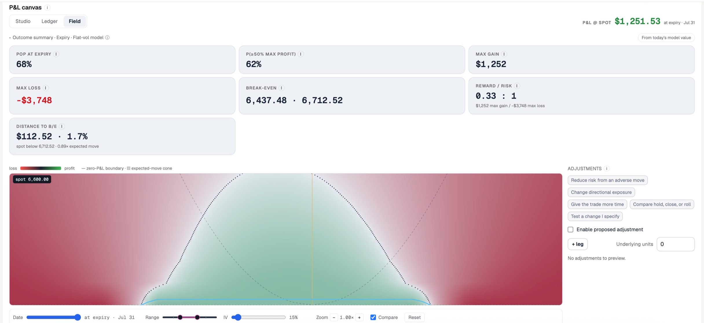
This condor is fine. Spot sits dead centre, 68% probability of profit, and the nearest break-even is $112.52 away — 1.7%, or 0.89× the expected move. Nothing is under test.
The only uncomfortable number is the shape of the bet: max gain $1,252 against max loss $3,748, a reward/risk of 0.33 : 1. You are risking three dollars to make one. That is the deal every condor seller signs, and it is precisely why adjusting one badly is so expensive — there isn't enough profit in the trade to absorb a mistake.
What you actually own: two strangles, not four legs
Ask the app what the position is, and the answer is not "an iron condor."
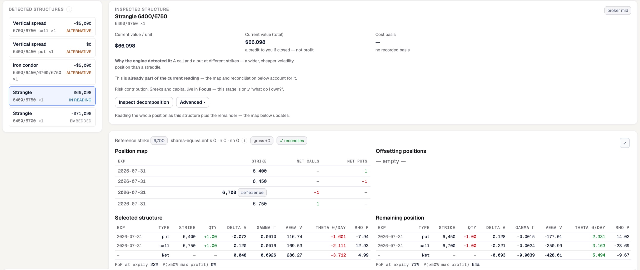
The reading in force is long strangle 6400/6750 plus a short strangle 6450/6700 — the outer wings you bought and the inner strikes you sold. That is what an iron condor is: a short strangle wearing protection.
Three details in this panel are worth more than any payoff chart.
The component values are gross, not profit. The long strangle shows $66,098 and the short strangle -$71,098. Netted, that's the -$5,000 the iron condor line shows. The app labels the value precisely — "a credit to you if closed — not profit" — and marks the overlapping readings ALTERNATIVE so you can't add them up. Five candidate structures, one position.
The two halves have opposite characters. Look at the greeks split. Your long strangle carries +286.27 vega and -3.712 theta — it costs you money every day and profits from volatility. The remaining short strangle carries -428.01 vega and +5.494 theta — it pays you daily and hates volatility. They are opposite trades stapled together.
And opposite odds. The wings alone have a 22% chance of profit at expiry. The short strangle has 71%. The whole position has 68%. The piece that makes the money is the piece that can hurt you; the piece that protects you is, standalone, a losing bet. That's the bargain.
Step 2: the risk is not where you're looking
Expand the Focus stage on the downside lens and the model attributes a 4% drop piece by piece:
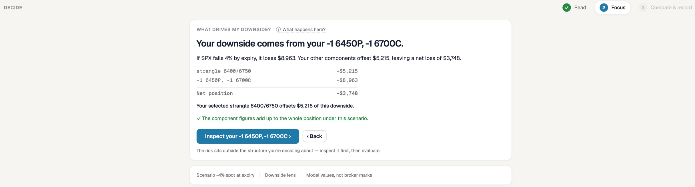
Read the arithmetic. The short strangle loses $8,963. The long wings claw back $5,215. Net: -$3,748 — which is exactly the max loss from the summary screen. The components reconcile.
Then read the line underneath, which is the whole article in one sentence:
> The risk sits outside the structure you're deciding about — inspect it first, then evaluate.
The trader here has selected the long strangle — the protection — and the app is telling them, before they touch anything, that they have the wrong piece in their hands. The breakdown makes it visual:
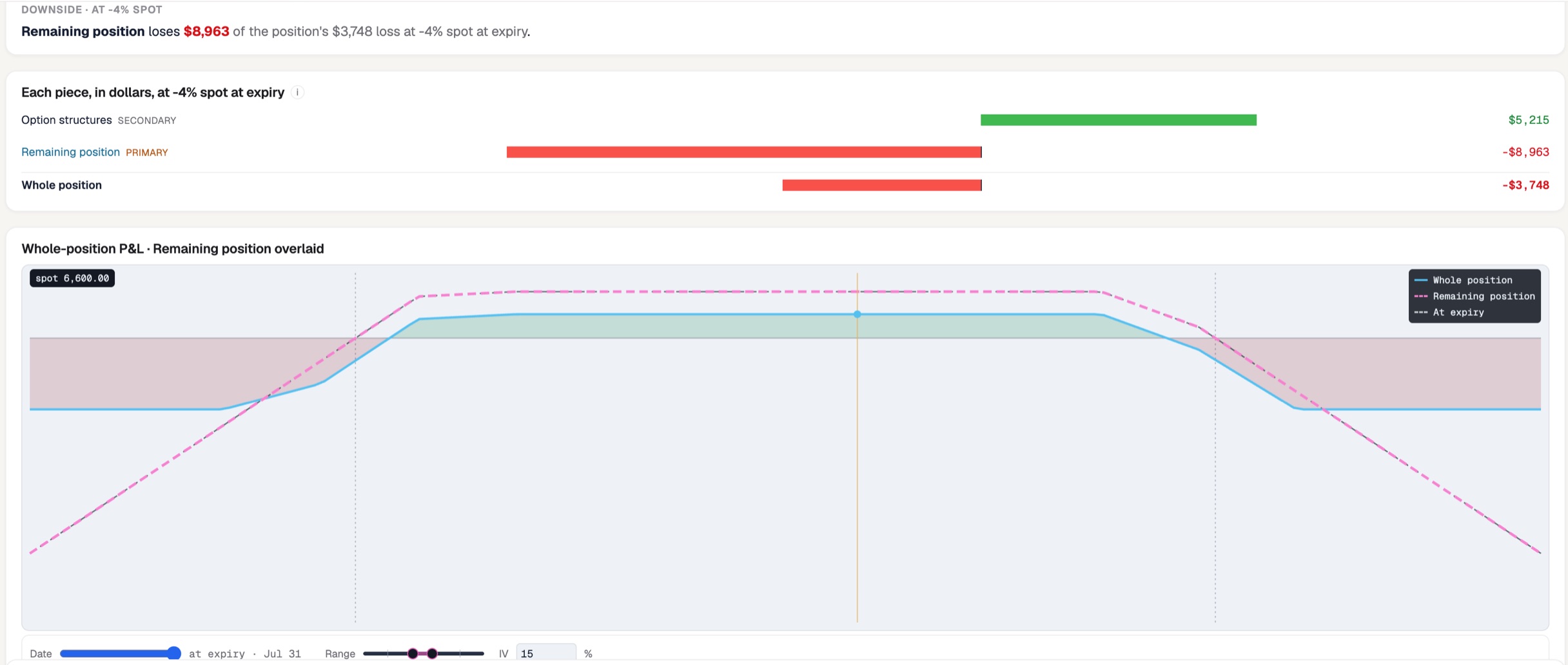
The green bar is your insurance. The red bar marked PRIMARY is your risk. If you're going to act on something, act on the red one.
The trap: closing the protection
Suppose you don't. Suppose you close the piece you were inspecting — the long strangle — because it's a losing component with 22% odds and closing it pays cash. Here is what the app says:
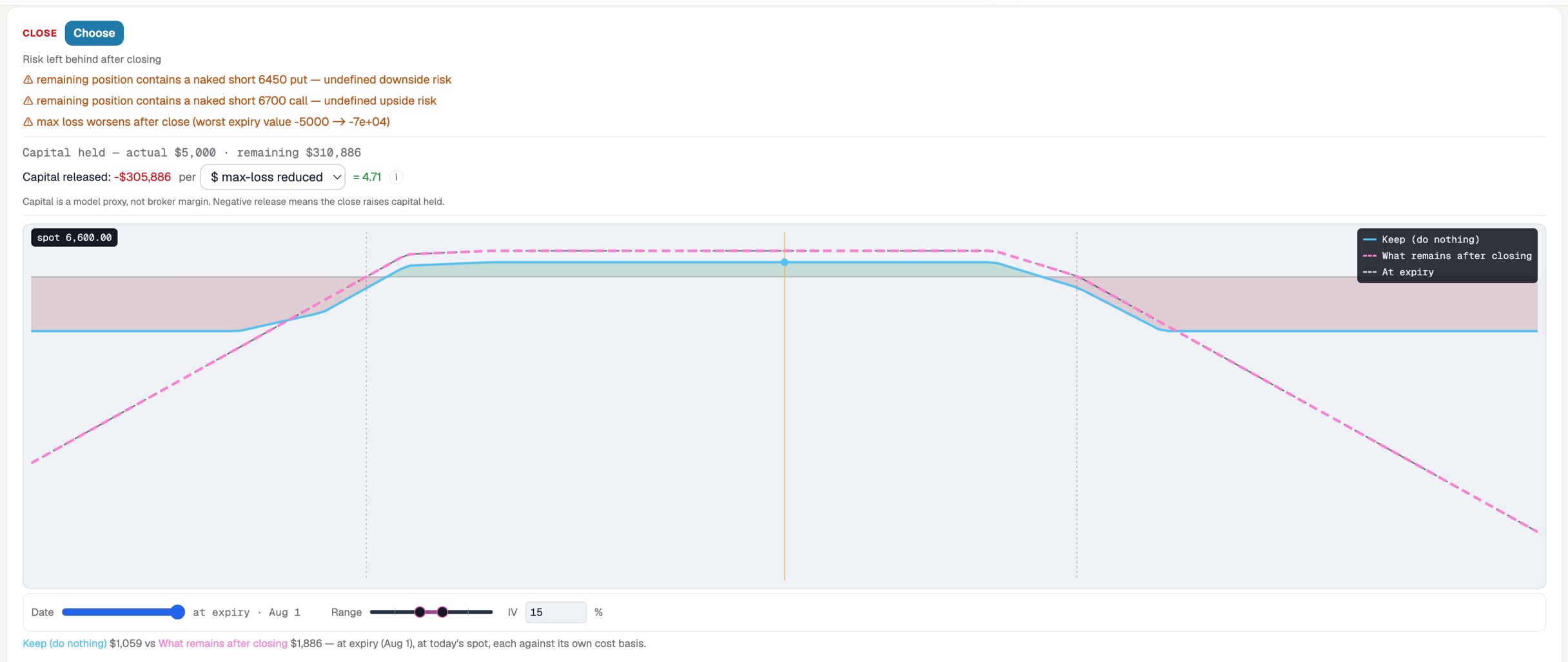
Three warnings, stacked:
- "remaining position contains a naked short 6450 put — undefined downside risk"
- "remaining position contains a naked short 6700 call — undefined upside risk"
- "max loss worsens after close (worst expiry value -5000 → -7e+04)"
And the capital line, which is the one that should stop your hand: capital held goes from $5,000 to $310,886. Released capital is -$305,886 — negative, and the app spells out what that means: "Negative release means the close raises capital held."
You would have turned a $5,000 defined-risk position into an undefined-risk one requiring three hundred thousand dollars of capital, by clicking "close" on the losing piece.
Now here is the genuinely dangerous part. At today's spot, closing looks better: keep is worth $1,059, what remains after closing is worth $1,886. The seductive number and the catastrophic number sit four inches apart on the same screen.
Why the stress table alone would have fooled you
Open the shock comparison and it gets worse before it gets better:
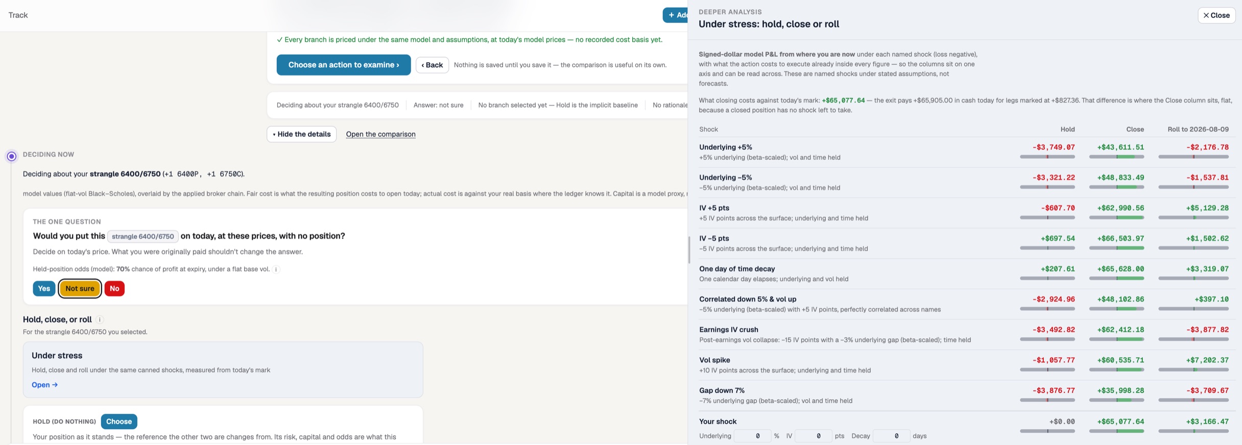
Every number in the Close column is enormous and green: +$43,611 on a 5% rally, +$48,833 on a 5% drop, +$35,998 on a 7% gap down. If you read this table on its own you would close in a heartbeat.
The header tells you why, if you read it: "the exit pays +$65,905.00 in cash today for legs marked at +$827.36." That column is not measuring whether you are better off. It is measuring cash received, against a position whose risk has just become unbounded. The stress table prices shocks; it does not price "undefined." The warnings in the close panel do that, and you need both.
This is worth internalising as a general habit. A single view can be locally honest and globally misleading. The discipline isn't to find the one screen that gives you the answer — it's to refuse to act until the screens agree.
By contrast, read the Hold column and you get the flat, boring truth of a healthy condor: -$3,749 on a rally, -$3,321 on a drop, +$207.61 for a day of decay, +$697.54 if vol falls five points. Losses capped near max loss, gains small and slow. Exactly what you signed up for.
The roll: quietly becoming a different trade
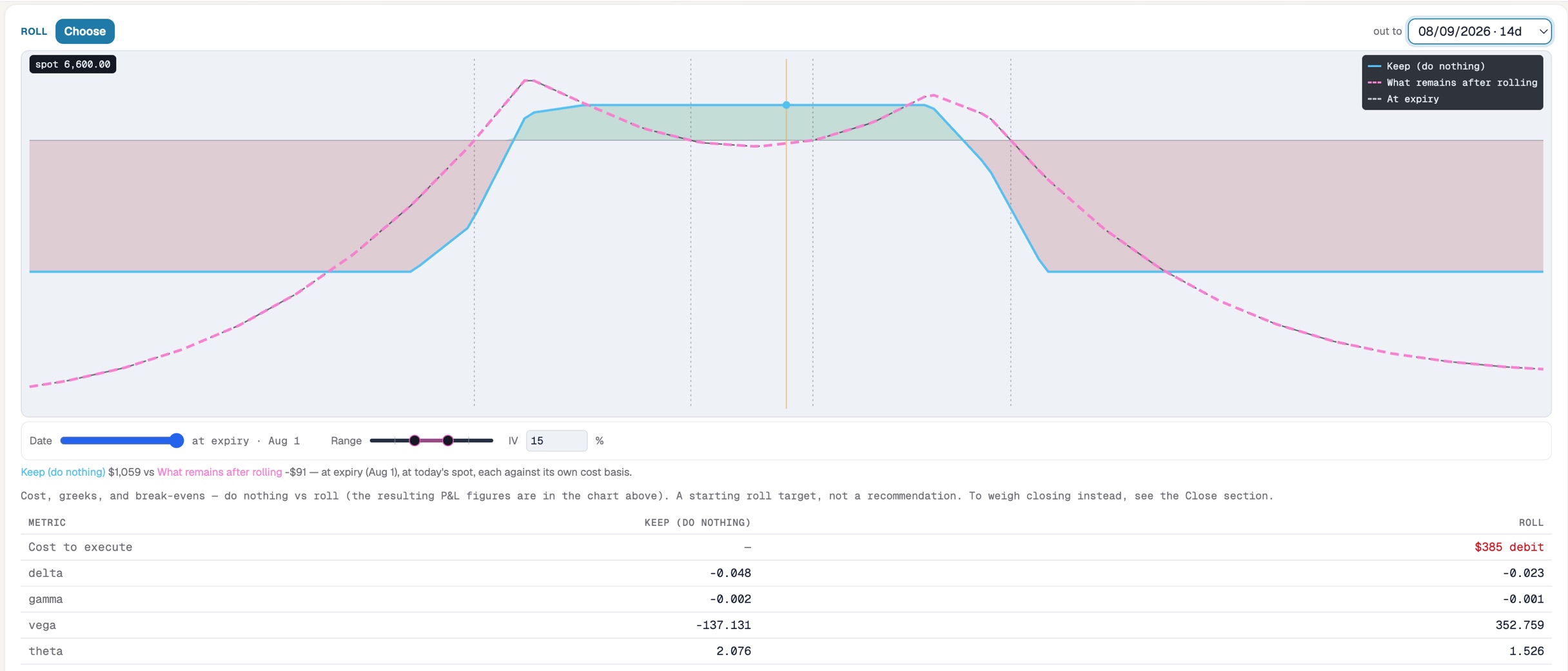
Rolling the wings out fourteen days costs a $385 debit and converts $1,059 of value into -$91. But the number that matters is vega:
-137.131 → +352.759.
That is a sign flip. You began short volatility — the normal condor stance, where you profit from calm — and you would end up long volatility, positioned to profit from turmoil. Theta drops from 2.076 to 1.526, so the clock pays you less for the privilege. Nobody sets out to invert their volatility exposure; it happens when you roll one half of a two-sided structure and don't check what the halves were doing.
The app's own label on the roll is the correct one: "a starting roll target, not a recommendation."
The rule
Decide about the component that owns the risk. Not the one that's losing, not the one that's cheapest to trade, not the one you happened to click on. In this position that means the short 6450 put and short 6700 call — the pieces with the $8,963 downside and the 71% odds — not the wings that were quietly doing their job.
The generalisation holds across structures. A broken wing butterfly is a clean fly plus a directional tail. An iron condor is a short strangle plus protection. When a position gets stressed, decompose it, find which piece owns the risk, and act on that piece.
And when the trade is fine — as this one is, 68% and centred — the correct adjustment is frequently none at all. A 0.33 : 1 payoff cannot fund many clever ideas.
Model the branches before you need them
Everything above was mechanical: read the position as its real components, attribute a scenario to them, price every branch under identical shocks, and read the warnings next to the numbers rather than instead of them. The mistake this article is about takes one click and is invisible on a payoff chart.
That decomposition — carving a book into the strangles, verticals and butterflies it's really made of, with every component reconciling back to the whole — is the core of how Risk Illustrator works, and comparing the branches side by side is what its Decide tab is for. Model the decision, not just the trade.
All figures are model values under flat volatility for illustration — live markets add skew, spread, and assignment considerations. Nothing here is investment advice.